Showing posts with label twitter. Show all posts

2012-02-04

Hour-by-hour Comparison of Beijing's PM2.5 Pollution

Public outcry over the air quality in Beijing has impelled the government to start releasing PM2.5 pollution data, something the U.S. Embassy has been doing via Twitter since 2009. For some background on "PM2.5", see this post on the air pollution situation in Beijing. In short, PM2.5 is a dangerous form of pollution, measured in micrograms per cubic meter. The WHO's standard for a maximum acceptable yearly average is 10 μ/m3; Beijing regularly sees days over 200 or 300 μ/m3.

Now that we have an official source of hourly PM2.5 measurements in Beijing, it seems appropriate to do an hour-by-hour comparison with the embassy's, duly noting that different values from each station do not necessarily indicate inaccurate data from either source. The U.S. Embassy takes their measurements in eastern Beijing near Liangmaqiao and the Beijing Municipal Environmental Monitoring Center (BJMEMC) takes theirs in the west near Chegongzhuang, a six-mile distance. The different environments and equipment undoubtedly add to variability. In the past, local officials have stated that the embassy's location near construction sites and a major road inflate their measurements. (As a side note, if that is the case, the embassy's inflated data would more accurately represent a person's daily experience given the prevalence of both features.)

PM2.5 sensor locations in western and eastern Beijing


The Data
The numbers compared here cover February 2 to 4 for a total of 45 measurements. BJMEMC currently provides access to only the last 24 hours of data. Note that the embassy did not have data for 21:00 and 23:00 on February 2, so those times were omitted.

BJMEMC U.S. Embassy Difference
Average PM2.5 (μ/m3) 33.51 49.07 31.70%
Average Hourly Change 12.80 10.39 18.83%
AQI (U.S.) Equivalent 95 123 1 category

Beijing PM2.5 levels, Feb 2 - 4, 2012

BJMEMC's measurements were at times higher than those of the embassy, but on average the embassy recorded poorer air quality. The different was enough to bump the embassy's average into a more serious AQI category. Also, the BJMEMC data's hourly fluctuation was higher. On two occasions the BJMEMC readings dropped to 3 μ/m3 and remained there for two hours. This could be an error, especially at 18:00 February 3, when the reading jumps back to 111 μ/m3 an hour later.


Impressions
Overall, the results are consistent, but different enough to rank as "Moderate" at BJMEMC's sensor and "Unhealthy for Sensitive Groups" at the embassy. The important difference, though, is not between the BJMEMC and embassy data, but between BJMEMC's own PM10 and PM2.5 measurements. Up to now, official assessments of the air pollution were based on PM10 pollution, which does not have the same health implications as the finer PM2.5 pollution and was often measured in lower concentrations. For example, BJMEMC's assessment of the last 24 hours, based on PM10 at a nearby location, is "Excellent", which is not consistent with the visible pollution outside. With these new measurements, an informed public can now make health-conscious decisions.

But what about an uninformed public? Unfortunately, the web page does not translate its measurements into an AQI category and qualitative description (or "API" in the Chinese standard). Further increasing the potential for misinterpretation, the measurements are given in milligrams instead of the usual micrograms. And finally, the descriptions of the pollution levels don't seem consistent with the given health effects. For example, the description:
Significantly aggravated symptoms in heart disease and lung disease patients, reduced exercise tolerance, and general symptoms in healthy people. Recommended that the elderly and patients with heart disease or lung disease stay indoors and reduce physical activity.
is matched with "Moderately polluted", a term that itself makes no implications about health.


The Website
Less satisfying than the data is the platform through which they are distributed. Unlike the embassy feed, which can take advantage of all of the distribution methods offered by Twitter, the BJMEMC data are trapped on a web page that is not even directly accessible from a URL. Instead, users must click a PM2.5 tab that loads the data in an iframe element using Javascript. The target page in that iframe cannot be accessed directly due to some validation techniques with Javascript and some hidden form fields. When we consider that the page only shows 24 hours at a time and does not provide an archive, it will be very difficult to extract these measurements in bulk for research purposes. Furthermore, the measurements are not updated consistently; the 21:00 measurement was the last added on February 3.

What is really disappointing—and telling—is this bit of HTML:
<body ondragstart="return false" onselectstart="return false" oncopy="document.selection.empty()" onbeforecopy="return false">
This was added to prevent users from selecting or copying the text on the page. Fortunately, it seems the site was developed on and for Microsoft applications and the controls do not work in Firefox, leaving users of that browser free to copy the text. These methods are supposed to be deprecated in WebKit as well, but I could not select any text in Chrome.

Regardless, I'll be exploring ways to capture the data in a more usable format.


Conclusion
The data quality is not perfect, but neither is the embassy's. The data access as it is currently provided can hardly be described as open, but it is definitely ajar, allowing citizens to peek in and maybe get a foot in the door to negotiate on some of the government's other data. This is a big step for such a secretive, paranoid authority, and the government deserves a pat on the back for it. Still, Beijingers need to push for:
  • Setting up more sensors in representative locations
  • Improving the data distribution platform and reducing the delay in publication
  • Expanding this practice into other datasets, especially in public health
Once BJMEMC gets a sensor near the embassy, I'd like to see another comparison.

2011-07-08

Beijing Air Comparison: Good vs. "Hazardous"

On June 22, 2011, Beijing had a particularly miserable day as far as air pollution goes. It wasn’t as serious as the “crazy bad” day in November 2010, but it was still remarkably polluted. Visibility was low, it stunk, and I could actually taste the pollution in the air.

Air pollution in Beijing, June 2011

According to the sensors used at the U.S. Embassy in Beijing, the pollution level was "Hazardous", meaning it had an air quality index value greater than 300. At its worst it was 473 that day (the scale only goes up to 500), with a PM2.5 concentration of 459 micrograms per cubic meter. For reference, in 2009, the average PM2.5 concentration in the Los Angeles area was "only" 12.68, and the World Health Organization recommends an average annual exposure of no more than 10. Keep in mind that the 10 μ/m3 guideline is only an "acceptable and achievable objective"—not even necessarily a safe level.

Progression of Beijing's air pollution on June 22, 2011

Readings from the sensors at the U.S. Embassy, as posted to Twitter, @beijingair

Then, just a couple days later, Beijing saw some of the best air it's had in a while.

Great air in Beijing, June 2011

For two whole hours the sensors reported air pollution levels within acceptable limits.


In Beijing, barely acceptable = outstanding

To be fair, Beijing is somewhat making progress in cleaning up the air. Earlier this year, we had a record number of consecutive blue-sky days—the best since 1998.

To compare the good and bad days, I made a page to easily switch back and forth between photos of Beijing's pollution.

2011-06-16

Twitter at Night

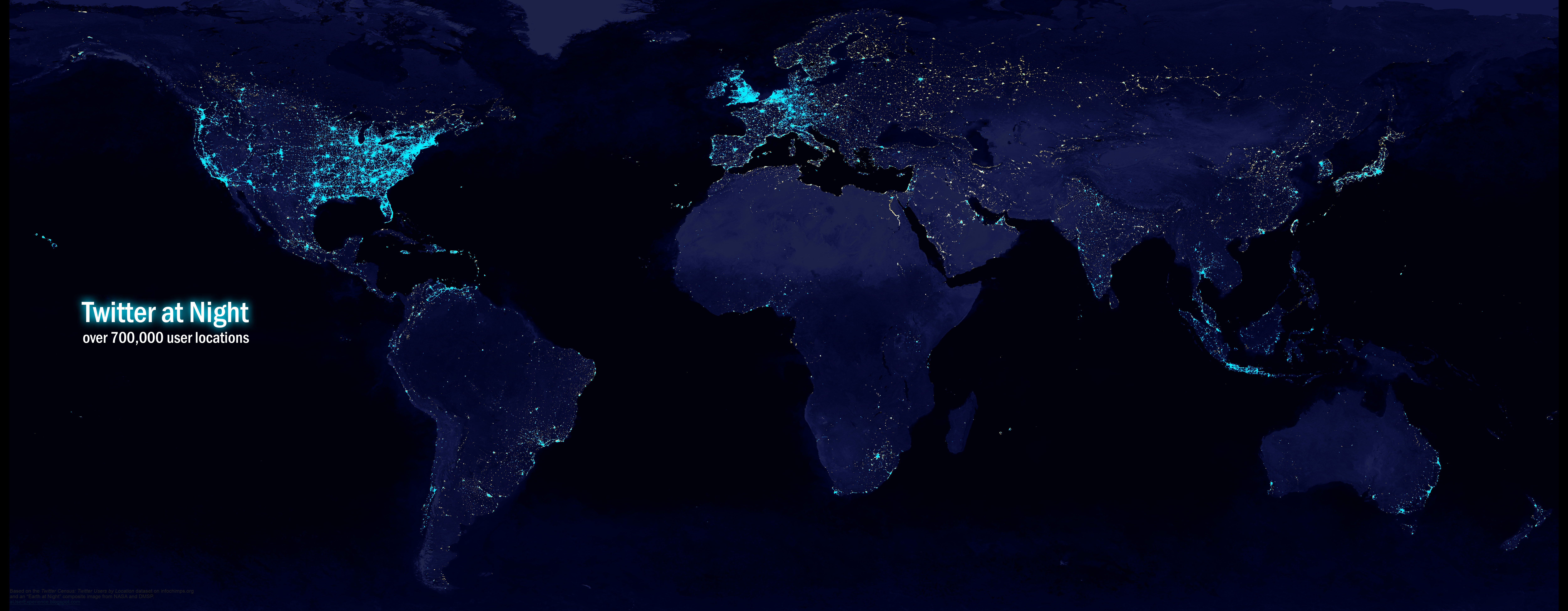
I found a dataset of Twitter user locations and wanted to see what it looked like as a map. In particular, I wanted to make it look something like an “Earth at night” image and compare global light pollution with global Twitter activity. The idea is to separate industrialization from “informatization”. If a luminous place lacks proportional web activity, the characteristics of that city or country could tell us something about the nature of the digital divide, including non-technical aspects like politics.

A dataset like this could also be a useful addition to Digital Earth, as a location's web activity would be an interesting and increasingly important characteristic.

The dataset, found on infochimps.org, contains 3.8 million locations for tens of millions of Twitter users. It was gathered by mining data from user profiles between 2006 and 2010. For the uninitiated, Twitter profiles have an open text field where users can enter their location. This means it may contain any number of things, including country names, street addresses, coordinates, or “woudnt u like 2 no ;D”. While addresses and text like “Nap Town All Day Babyyyy” could have been geocoded, for this project I decided to only keep coordinates. Furthermore, I only kept coordinates that appeared to have been automatically entered by third-party applications or location-aware devices. These were prefixed by something like “iPhone:”. To clean the data, I used regular expressions in Notepad++, then did some manual cleansing in Excel.

When all was said and done, the dataset was significantly reduced, but still contained over 700,000 unique locations. QGIS and Photoshop helped produce an interesting visualization:


Twitter at Night: The globe illuminated with Twitter user locations
10000 x 3900 1.2MB jpeg*

You can see some imperfections in the data on the political map, e.g., points in the water, but we get the idea:

716,412 points plotted from coordinates taken
from the location field of Twitter user profiles
15000 x 6630 1.3MB gif*

Here is an “Earth at Night” composite image from NASA and the Defense Meteorological Satellite Program with the Twitter data overlaid. Not surprisingly, places like North Korea have few lights and also few Twitter points. But Eastern Europe, Russia, China, North Africa, and India are fairly well-lit with very sparse Twitter coverage. And take a look at Cuba – there isn’t a single point.

Twitter user locations plotted over a map of the world's lights
10000 x 3900 2.8MB jpeg*

Some things to keep in mind:
  • These are mostly locations of mobile users, and the data are not necessarily a representative sample of Twitter users (or Internet users).
  • In some countries, other microblogging services may be popular
  • In mainland China, Twitter has been blocked since 2009. The lack of Twitter activity in China isn’t a good indicator of Internet access, but it can say something about a different kind of digital divide, maybe an information divide.
Here is a higher quality PNG of the Twitter at Night image (3.9 MB, 10000 x 3900).

*Note that all of these images have really high resolutions. If your browser has trouble displaying them, try right-clicking on the links and saving to your computer.