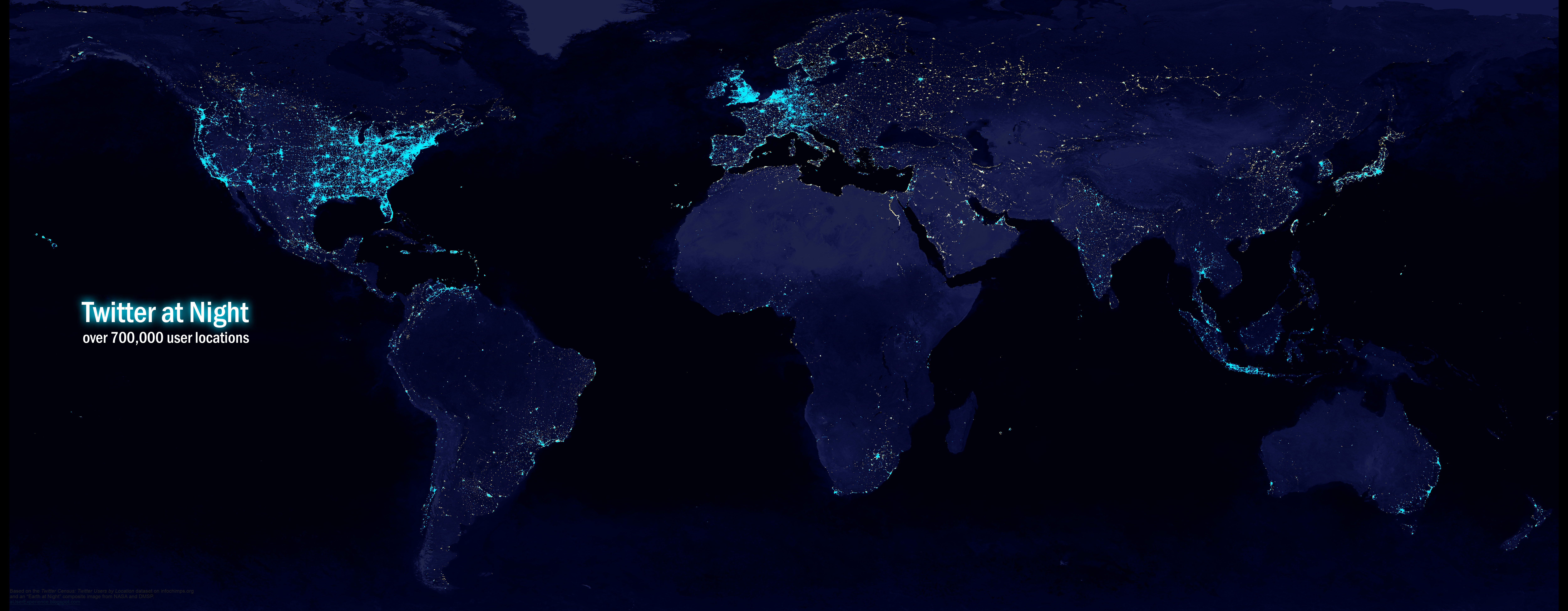
I found a dataset of Twitter user locations and wanted to see what it looked like as a map. In particular, I wanted to make it look something like an “Earth at night” image and compare global light pollution with global Twitter activity. The idea is to separate industrialization from “informatization”. If a luminous place lacks proportional web activity, the characteristics of that city or country could tell us something about the nature of the digital divide, including non-technical aspects like politics.
A dataset like this could also be a useful addition to Digital Earth, as a location's web activity would be an interesting and increasingly important characteristic.
The dataset, found on infochimps.org, contains 3.8 million locations for tens of millions of Twitter users. It was gathered by mining data from user profiles between 2006 and 2010. For the uninitiated, Twitter profiles have an open text field where users can enter their location. This means it may contain any number of things, including country names, street addresses, coordinates, or “woudnt u like 2 no ;D”. While addresses and text like “Nap Town All Day Babyyyy” could have been geocoded, for this project I decided to only keep coordinates. Furthermore, I only kept coordinates that appeared to have been automatically entered by third-party applications or location-aware devices. These were prefixed by something like “iPhone:”. To clean the data, I used regular expressions in Notepad++, then did some manual cleansing in Excel.
When all was said and done, the dataset was significantly reduced, but still contained over 700,000 unique locations. QGIS and Photoshop helped produce an interesting visualization:
 |
| Twitter at Night: The globe illuminated with Twitter user locations 10000 x 3900 1.2MB jpeg* |
You can see some imperfections in the data on the political map, e.g., points in the water, but we get the idea:
 |
| 716,412 points plotted from coordinates taken from the location field of Twitter user profiles 15000 x 6630 1.3MB gif* |
Here is an “Earth at Night” composite image from NASA and the Defense Meteorological Satellite Program with the Twitter data overlaid. Not surprisingly, places like North Korea have few lights and also few Twitter points. But Eastern Europe, Russia, China, North Africa, and India are fairly well-lit with very sparse Twitter coverage. And take a look at Cuba – there isn’t a single point.
Some things to keep in mind:
 |
| Twitter user locations plotted over a map of the world's lights 10000 x 3900 2.8MB jpeg* |
Some things to keep in mind:
- These are mostly locations of mobile users, and the data are not necessarily a representative sample of Twitter users (or Internet users).
- In some countries, other microblogging services may be popular
- In mainland China, Twitter has been blocked since 2009. The lack of Twitter activity in China isn’t a good indicator of Internet access, but it can say something about a different kind of digital divide, maybe an information divide.
Here is a higher quality PNG of the Twitter at Night image (3.9 MB, 10000 x 3900).
*Note that all of these images have really high resolutions. If your browser has trouble displaying them, try right-clicking on the links and saving to your computer.
*Note that all of these images have really high resolutions. If your browser has trouble displaying them, try right-clicking on the links and saving to your computer.